
⚙️ Traces from the dawn of innovation
Hamburger Menu Icon Origin: Xerox Star's Tiny Space Saver
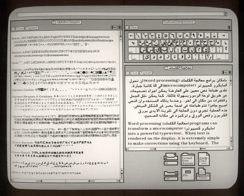
- What: The hamburger menu icon was created by Norm Cox for the Xerox Star as a compact way to indicate hidden menu options in a space-limited interface.
- Where: Xerox’s interface design environment for the Xerox Star workstation.
- When: Around 1980, with the Xerox Star reaching market in 1981 and wider mobile use much later.
The hamburger menu icon was not invented for phones. It was drawn at Xerox around 1980 by interface designer Norm Cox for the Xerox Star, a workstation that reached the market in 1981.
Why Xerox Star Used It
The problem was simple and practical: screen space was limited, and menus took up room. Cox designed a compact symbol made of three horizontal lines that could signal a list of options without keeping the full menu visible all the time. It was a small interface decision inside a much larger system, but it solved a real constraint on an early graphical computer.
That matters because Xerox Star was one of the first commercial systems to bring together ideas that later became standard in graphical user interfaces: windows, icons, and mouse-driven interaction. In that setting, even tiny visual choices carried weight. The three-line icon was not a grand manifesto about the future of design. It was a way to mark a hidden menu clearly and economically.
How the Hamburger Menu Spread
Years later, the symbol escaped its original context. As software moved onto smaller screens, especially phones, the same old problem returned in a harsher form: there was even less room for visible navigation. The three stacked lines offered a familiar answer. By the 2010s, the hamburger menu had become one of the most recognizable interface elements in mobile apps and responsive websites, acting as a compact gateway to settings, sections, and tools.
Its spread was not automatic, and it has never been universally loved. Designers have argued over whether hiding navigation behind an icon makes features harder to discover. That criticism is real. But the symbol lasted because it balanced two competing needs that never fully go away in interface design: clarity and space.
From Xerox Fix to Standard
The useful context is this: many famous interface elements did not begin as cultural symbols. They began as local fixes to technical limits. Cox’s three-line mark is a clean example. A small graphic made for the Xerox Star’s cramped display became, decades later, the tiny door that millions of apps used to hold an entire menu.
Did You Know?
The Xerox Star was notable for helping popularize the desktop metaphor, including windows and icons, which later became standard in graphical user interfaces.